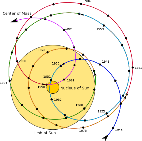
I quickly found two pictures that illustrate the motion of the Sun with respect to the known Solar System barycentre: from: here and here.
The first claims to show the track of the solar system barycentre in the heliocentric reference frame. The outer yellow circle marks the photosphere of the Sun. The second plot claims to show the track of the centre of the Sun in the barycentric reference frame. The yellow circle shows the photosphere of the Sun to scale. As you can see, the plots are actually (almost) the same! Given that to go from one frame to the other is just a translation, I suppose they can both be right providing the x and y axes are defined appropriately.
To answer the questions posed: "What does it look like" - it looks like these two pictures. "How large is it?" As you can see, the maximum separation between the barycentre and the solar centre appears to be about 2 solar radii over the timescale covered by these plots, but is as small as a tenth of a solar radius (e.g. in 1950). "How elliptic?" Not at all really, it is a complicated superposition caused by the orbits mainly of Jupiter and Saturn, but all the planets contribute to a greater or lesser extent.
The barycentre is calculated from the instantaneous positions of all the discrete masses in the Solar System, by finding their common centre of mass. $$\sum_i m_i({\bf r}_i -{\bf r}_{\rm bc}) = 0\ .$$ I do not know for sure, but I assume the summation for these pictures includes the Sun and all of the planets, and that everything else is negligible at the scale of the thickness of the line. If we define a coordinate system with ${\bf r}_{\rm bc}=0$, then the position of the Sun is $${\bf r}_\odot = -\frac{\sum_j m_j {\bf r}_j}{M_\odot}\ , $$ where the sum now is over just the planets.


