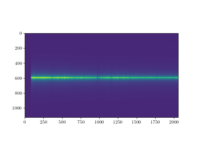
I have the 2D data (shape(1125,2058) taken by a long slit spectrograph, which looks as follows:
 The y-axis corresponds to the distance from the center, where the center is at the most bright green part (y_index about 595). The x-axis corresponds to the wavelengths. The data shows the long-slit-spectra of an elliptical galaxy. And here is where I am getting a bit confused, I expected the red end of the spectrum (i.e. longer wavelengths) to be more bright, since ellipticals have a red continuum, due to their old stellar population. In the plot, the spectrum is clearly more bright on the left, does that mean that the wavelength goes from right to left? Of course I also extracted the wavelength array from my fits file, if I include it into the plot, it runs from left to right. But I guess since my wavelength range does not extend into the red part of the spectrum only until yellow (570 nm) this resolves the problem?
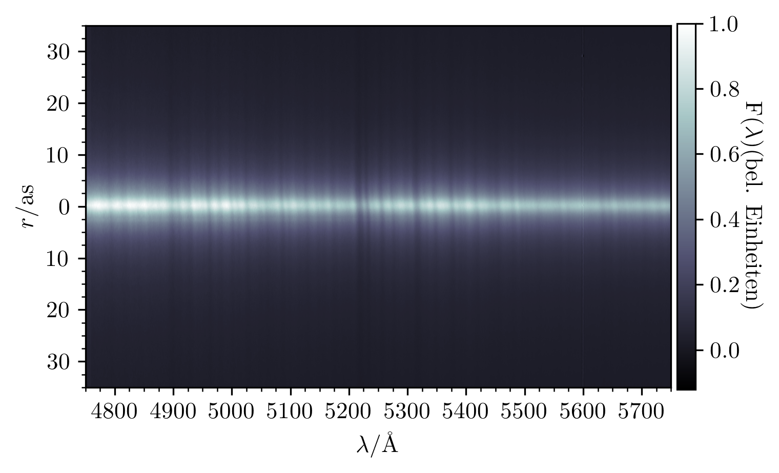
After some changes one can see the absortpion lines as well as the rotation of the galaxy.

-
1$\begingroup$ Your wavelength range is not very large, and in particular doesn't include the Balmer break and the 4000 Å break, so I'm not sure it's so surprising that it looks flat-ish. From ~4800 Å to a Mg line at ~5200 Å the spectrum actually typically does decline a little, but after that it should increase again, I think. But perhaps extract the 1D spectrum? I think that would make it easier to see. $\endgroup$– pelaCommented Mar 21, 2023 at 12:24
-
$\begingroup$ to my understanding the balmer break and the 4000 $\AA$ break in elliptical galaxies is roughly at the same wavelength right? the 1d spectrum from the center looks pretty much as expected for the wavelength range $\endgroup$– trynerrorCommented Mar 21, 2023 at 12:37
-
$\begingroup$ Was just wondering why there is more blue light then yellow light in the central region. $\endgroup$– trynerrorCommented Mar 21, 2023 at 12:38
-
$\begingroup$ Yes, the two breaks partially overlap (but evolve differently with age of the stellar population). $\endgroup$– pelaCommented Mar 21, 2023 at 15:35
-
1$\begingroup$ And yes, I understand that you're puzzled as to why the spectrum seems to decrease toward longer wavelengths, and I agree that it should stay flat or increase somewhat. But if you look at other elliptical galaxy spectra, you'll see that it's not unusual to decrease in the first half of your range. It should then increase again, which is indeed puzzling, but see Peter Erwin's answer. And then perhaps try and extract the 1D spectrum which might be more easily interpreted. $\endgroup$– pelaCommented Mar 21, 2023 at 17:24
1 Answer
In the plot, the spectrum is clearly more bright on the left
One possibility is that this was taken with a blue-sensitive CCD, and/or the diffraction grating has a higher efficiency in the blue. In general, the recorded brightness is the product of the object's intrinsic brightness (in photons/sec per wavelength interval) and the spectral response of the system (telescope mirrors/lenses + grating + filters + CCD).
I would be grateful about tips on the colormap settings, so one can see the absorption lines and therefore also the rotation better.
You don't say how you are generating these displays, though I'm guessing it's via the Matplotlib library in Python. So, in case you're not already displaying the data with a logarithmic scaling, try that (i.e., display np.log10(data) instead of data. You could try other scalings as well (e.g., square root).
A second point is that you appear to be using the default "viridis" colormap of Matplotlib. This is a terrible colormap if what you want to see are faint variations in your data. I would suggest something like a rainbow color map, maybe the "turbo" color map which is a bit better than the older "jet" colormap.
-
$\begingroup$ I updated my plot with a different colormap and displayed the data logarithmically $\endgroup$ Commented Mar 22, 2023 at 7:33