1
$\begingroup$

Here is my problem statement:

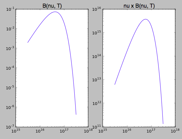
For a temperature of $7.3 \times 10^5 \ \text{K}$, make a graph of the Plank function (Eq. 3.24), plotting $\log_{10}{\nu} B_\nu(T)$ vs $\log_{10} \nu$ for $\log_{10} \nu$ between 15.5 and 17.5. How does the behaviour of your graph of a blackbody compare with that of Fig. 28.14 for the continuous spectrum of the quasar 3C 273?

Here is the equation 3.24

\begin{equation} B_\nu (T) = \frac{2h \nu^3/c^2}{e^{h\nu/kT}-1}. \end{equation}

I have put together an excel spreadsheet and created a graph of $\log_{10}({\nu} B_\nu(T))$ vs $\log_{10} (\nu)$, however, it is just a straight line (which is what I would have expected although the graph in the book is significantly different). I am wondering if I am misunderstanding the problem statement. What I did to get my data points for $\log_{10}{\nu} B_\nu(T)$ is I first computed $\nu$ values from the given range of $\log_{10} \nu$ values, then I computed B(T) values with the above-given equation. Then I substituted the product into logarithm : $\log_{10}({\nu} B_\nu(T))$, thus obtaining my $y = f(x)$ values. and then I plotted it against $x = \log_{10} \nu$. Am I doing things wrong or is this fine?
$\endgroup$
3
  • $\begingroup$ Welcome to Stack Exchange! If you are seeing a straight line, then I think you may have something wrong. See this answer. Can you copy the lines you've written in the spreadsheet cells and paste them into your question? That may be where the problem is, but without it it's hard to guess what's wrong. $\endgroup$
    – uhoh
    Commented Apr 28, 2019 at 3:17
  • 1
    $\begingroup$ I'm voting to close this question as off-topic because this is asking for programming help, not astronomy $\endgroup$ Commented Apr 29, 2019 at 15:37
  • 2
    $\begingroup$ BTW, if at all possible, do not use Excel. Grab Python, R, Matlab, FreeMat, etc. $\endgroup$ Commented Apr 29, 2019 at 15:38

1 Answer 1

3
$\begingroup$

Here's what I got for $\nu B_{\nu}(T)$ using Python, which is easy enough to read that maybe you can check against your Excel calculation. I also plotted just $B_{\nu}(T)$ for comparison.

Neither looks like a straight line and they shouldn't. If you print out $\log_{10}(k_B T / c)$ you get about 16.2 which is right in the middle of your range. They've specified a range of frequencies centered roughly on the peak of the Planck distribution.

enter image description here

def Bnu(nu, T):
    top = 2 * h * nu**3 / c**2
    bot = np.exp(h * nu / (kB * T)) - 1.
    return top/bot

import numpy as np
import matplotlib.pyplot as plt

h  = 6.6261E-34 # m^2 kg / s
c  = 2.9979E+08 # m / s
kB = 1.3806E-23 # m^2 kg / s^2 K

T   = 7.3E+05  # K

print "log10(kB T / h): ", np.log10(kB * T / h)

nu  = np.logspace(15.5, 17.5, 201) # Hz

lam = c / nu

print nu.min(), nu.max(), 'Hz'
print 1E+09*lam.min(), 1E+09*lam.max(), 'nm'

B = Bnu(nu, T)

plt.figure()

plt.subplot(1, 2, 1)
plt.title('B(nu, T)', fontsize=16)
plt.plot(nu, B)
plt.yscale('log')
plt.xscale('log')

plt.subplot(1, 2, 2)
plt.title('nu x B(nu, T)', fontsize=16)
plt.plot(nu, nu * B)
plt.yscale('log')
plt.xscale('log')

plt.show()
$\endgroup$

You must log in to answer this question.

Not the answer you're looking for? Browse other questions tagged .