In the Astrobites article Spectral Line Survey Reveals New Molecules in Two Protoplanetary Disks integrated emission maps depict the spatial distribution of the flux received from each "line." I am unsure as to what this line is, nor do I know what the x and y axes represent in terms of interstellar molecules' emissions. Do the x and y axes just represent the position and velocity of the molecules in a galaxy?
-
1$\begingroup$ aasnova.org/2020/07/07/… $\endgroup$– LÜHECCHEgonCommented Sep 24, 2021 at 6:17
-
$\begingroup$ added, thank you! $\endgroup$– uhohCommented Sep 24, 2021 at 6:21
-
$\begingroup$ If it helps, the full caption of the figure: "Moment-0 integrated emission maps of observations used as matched filter templates, demonstrating varied emission morphology. Emission for all species has been normalized by dividing by the peak emission. Contours for MWC 480 CO isotopologues (panels a–c) are [10, 20, 30, 40, 50, 75, 100, 125, 150] × σ and contours for LkCa CO isotopologues (panels i–k) are [5, 10, 15, 20, 30, 40, ...] × σ. Contours for all other panels are [3, 5, 7, 10, 15, 20, ...] × σ. Synthesized beams are shown in the lower left of each panel." $\endgroup$– Jean-Marie PrivalCommented Sep 24, 2021 at 10:25
1 Answer
Those are plots of the real spatial distribution of flux at certain frequencies, as it appears on the sky.
The latter can be seen as the x-y axis in each individual plot refer to the declination and rectascension ($\alpha-\delta$), i.e. standard celestrial coordinates.
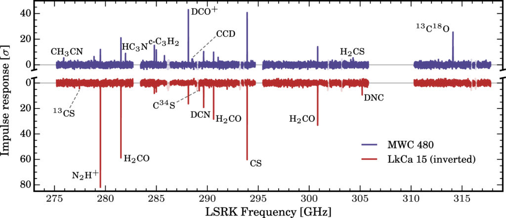
The link provided in a comment has a plot of the spectrum of the two discs:
Such a 'total spectrum' for the objects shows various molecular footprint lines in emission (LkCa 15 is inverted, hence those are emission lines as well). A line is hence simply the sharp emission peak that molecules emit at those energies (here those are rotational lines, but vibrational and electronic modes exist as well).
Now to get a better understanding where in the disc those molecules sit and how strongly they are concentrated, ALMA is able to measure the spatial flux distribution at a very sharp frequency, generating the above images.
They are called integrated emission maps, because you have to do a longer time-integration (10-30 mins) to get each of them. They also pose a fantastic tool for us, as as long as the emission is optically thin, the total flux is proportional to the total number of molecules, hence one can determine absolute numbers with those measurements and learn about the early chemistry in protoplanetary discs.
-
1$\begingroup$ I believe the reason these are called 'integrated' emission maps is not do with the longer time integration, but rather because the total flux in each pixel is integrated over the frequency space defined by the z-axis of the spectral cube from which the moment 0 maps are obtained. $\endgroup$– lucasCommented Sep 25, 2021 at 9:19
-
$\begingroup$ @lucas Ah yes, good point. I am not sure how wide the ALMA cube bins are then? Are the ALMA narrow bands still wide compared to a frequency width? $\endgroup$ Commented Sep 25, 2021 at 13:48
-
$\begingroup$ it depends on the spectral resolution required by the observation, but a typical example might be a cube with 480 channels covering a total width of 0.1 GHz (but the width of the spectral line itself will probably cover only a few of the central bins). Normally the frequency is described as a velocity, so each bin gives you the flux density (in Janskys, Jy), then integrating across them gives you total flux (Jy km/s) $\endgroup$– lucasCommented Sep 26, 2021 at 9:47

