0
$\begingroup$

In Sabine Hossenfelder's November 2019 video "Have we really measured gravitational waves?" (transcript, video), Sabine mentions the now famous image of the generally agreed-upon-to-be-very-likely first direct detection of a gravitational wave. It shows the now-famous chirp as both a noisy experimental line and a smooth line which one would reflexively believe to be the theoretical model-based fit to it.

Sabine points out that there does not seem to be any evidence that this line is the direct result of any rigorous calculation.

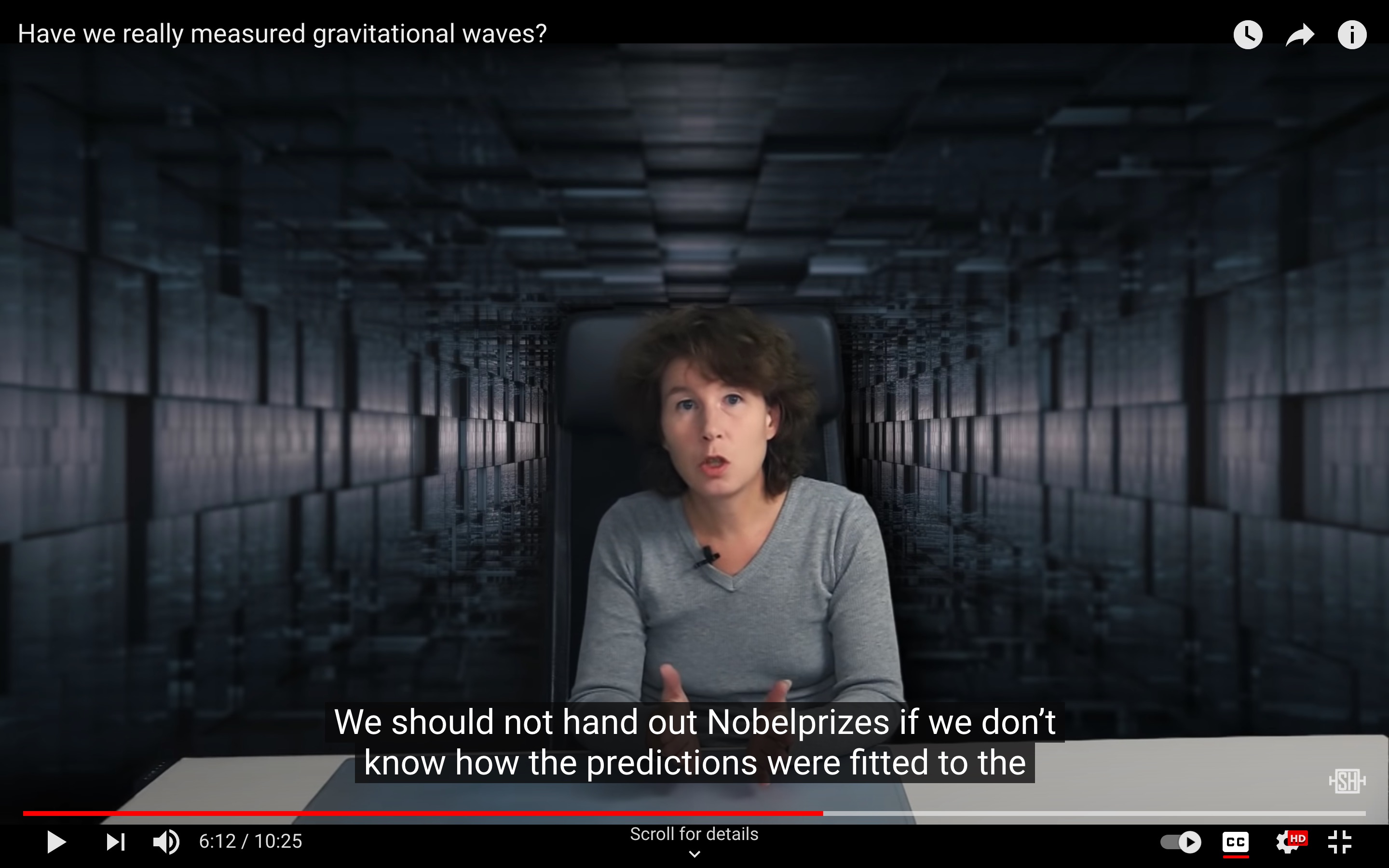
...saying it was "not found using analysis algorithsm" but partly done "by eye" and "hand-tuned for pedaggical purposes." For a reference on these quotes, please check the information below the video... We should not hand out Nobel Prizes if we don't know how the predictions were fitted to the data.

and in the notes below the video:

"Plot was made by eye" quotes: https://www.newscientist.com/article/mg24032022-600-exclusive-grave-doubts-over-ligos-discovery-of-gravitational-waves/

Questions:

  1. Was the Nobel prize for gravitational waves handed out based on a hand-drawn theoretical curve?
  2. Has the data been fit more rigorously now?

I'd like to emphasize that the content of the video goes way beyond this one curve and covers several different and interesting aspects of current gravitational wave detection and interpretation, verification and prediction. One should listen or use the closed captions and review the whole video if the topic is of interest.


Screen captures with closed-captions of relevant points
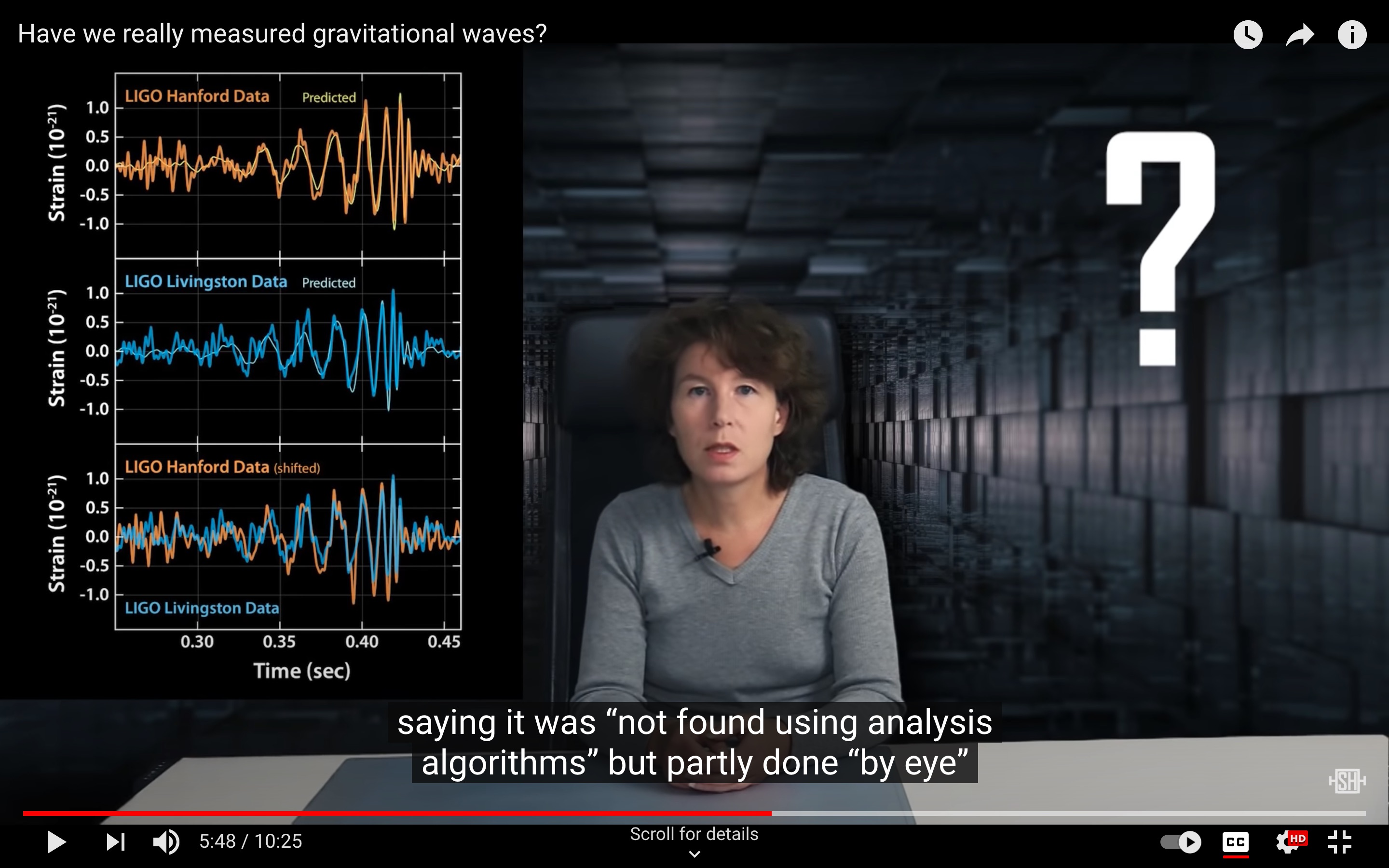
Screen capture with closed-caption of Sabine Hossenfelder's November 2019 video "Have we really measured gravitational waves?" Screen capture with closed-caption of Sabine Hossenfelder's November 2019 video "Have we really measured gravitational waves?" Screen capture with closed-caption of Sabine Hossenfelder's November 2019 video "Have we really measured gravitational waves?"

$\endgroup$
5
  • 9
    $\begingroup$ "Was the Nobel prize for gravitational waves handed out based on a hand-drawn theoretical curve?" This is a ludicrous summing up of 30 years work by thousands of scientists. $\endgroup$
    – ProfRob
    Commented Sep 25, 2021 at 11:02
  • $\begingroup$ @ProfRob yes, the prize is generally awarded to "contributions towards the understanding of" or similar. That point alone probably makes for a good answer. $\endgroup$
    – uhoh
    Commented Sep 25, 2021 at 11:13
  • 6
    $\begingroup$ "We should not hand out Nobel Prizes...". AFAIK, Hossenfelder (or her audience) played no role in awarding/judging the Nobel prize and "Have we really measured Gravitational Waves?" is just clickbait. $\endgroup$
    – ProfRob
    Commented Sep 25, 2021 at 11:19
  • $\begingroup$ Why is the first screen capture included in this post? It contains no relevant information for this question. $\endgroup$
    – TimRias
    Commented Sep 25, 2021 at 22:14
  • $\begingroup$ @mmeent I've removed it $\endgroup$
    – uhoh
    Commented Sep 26, 2021 at 2:11

2 Answers 2

10
$\begingroup$

To understand the history of the figure in question it is important to understand some of the context. In the run up to the operation of advanced LIGO, it was widely expected that the first detections would come in the form of relatively weak signals, whose presence in the data could only be established by comparing with theoretical templates through matched filtering. (As ended up being the case with the second event identified GW151226.) Consequently, quite elaborate algorithms were devised to identify such events and establish their significance. While very rigorous, these methods are fairly abstract in how they treat the data.

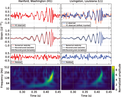
The detection of GW150914 therefore came as quite a surprise. It came from a much heavier binary than most had anticipated, resulting in a much louder and shorter signal. The signal was in fact so loud that one could discern its presence by eye when looking at data. To illustrate this the following figure was included in the discovery paper (1):

Figure 1 of (1)

It is important to realize that this figure was not part of rigorous statistical analysis of the data. Instead it was generated by taking some of the outputs of the rigorous analysis of the data to generate a representative waveform using numerical relativity, which was then overlayed on the data. It is my understanding that a number of steps in overlaying the waveform on the data ( like establishing various scaling and shifts due to its sky position) where essentially done “by eye”.

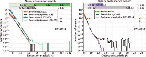
However, the real scientific analysis of the data was done with the rigorous algorithms that had been designed beforehand, resulting in the true “money plot” of the discovery paper (1), figure 4:

Figure 4 of (1)

While less “sexy” than Figure 1, and much harder to interpret to the layman, it is this figure that establishes beyond any reasonable doubt that the observed LIGO event was in fact the gravitational waves coming from a black hole binary merger. It is the analysis leading to this figure (and the detection of multiple later events) that lead to the awarding of the Nobel prize (not figure 1).

So the answers to your questions are:

  1. No the Nobel prize for gravitational waves was not handed out based on a “hand drawn theoretical curve”.
  2. Rigorous fitting of the data happened already in the original discovery paper (and its companions).

(1) B. P. Abbott et al. (LIGO Scientific Collaboration and Virgo Collaboration) Phys. Rev. Lett. 116, 061102 DOI: 10.1103/PhysRevLett.116.061102

$\endgroup$
2
  • $\begingroup$ Thank you for your answer! I'm starting to get a better understanding of of what's going on now. One suggestion; the figures are even harder to interpret by the layman when the captions are missing. Since the 2nd figure "establishes beyond any reasonable doubt that the observed LIGO event was in fact the gravitational waves coming from a black hole binary merger" it would be great to at least have a brief discussion of what the figure represents. Is it possible to reunite it with it's caption? $\endgroup$
    – uhoh
    Commented Sep 26, 2021 at 2:07
  • $\begingroup$ If you're on a mobile device at the moment and you like, I can help make the edit. $\endgroup$
    – uhoh
    Commented Sep 26, 2021 at 2:08
4
$\begingroup$

This issue is a bit complex, and at its core revolves around the claim of a Copenhagen group led by Andrew Jackson that LIGO data was not handled correctly, a mislabeled plot, and some small (but since resolved) controversy regarding the transparency of LIGO science.

When LIGO published their initial findings, they included a plot that was, indeed, adjusted for pedagogical purposes but this was not the plot that LIGO based their discovery on. That key detail was misunderstood (understandably, because LIGO failed to mention that the plot was a pedagogical one in the paper) by Andrew Jackson and his team who sought to replicate the data reduction done by LIGO.

Following the initial claim by Andrew Jackson and his team that LIGO had not dealt with the noise in their data as they should have, two independent research groups (independent of the Danish group and of LIGO) delved in to determine why they were getting results, and essentially determined that the Copenhagen group had made a mistake.

Based off of independent papers released by John Moffat (et al.) and Alex Nielsen (et al.) as well as an internal investigation done by LIGO, they raised some major concerns that Andrew Jackson kind of just insulted by calling Moffat’s paper “absolute rubbish” without actually addressing the issues raised by Moffat and Nielsen. It sounds like Andrew Jackson (at the time of the article I’m referencing) wanted to prepare a response to this, but based off of an interview with Moffat it seems Jackson did not completely understand the claims Moffat was making, and the paper will likely address those misconceived notions.

These proceedings were important, as more transparency is always better, but it seems the vast majority of the community has moved on, accepting the errors pointed out by the three parties as sufficient reason why the Copenhagen group came out with different results. All evidence does suggest that people were quite concerned at the time, and all are even more confident now then ever before.

So to answer the two questions succinctly, it turned out it was done rigorously from the beginning after all, there was just a mislabeled plot and a misguided Jackson that made everyone worry for a bit.

To really dive deep into what led to the Copenhagen group’s mistake, see this article : https://www.quantamagazine.org/studies-rescue-ligos-gravitational-wave-signal-from-the-noise-20181213/

$\endgroup$
7
  • 1
    $\begingroup$ Wow thank you for the speedy and insightful answer! I'll give the Quanta article a good read. $\endgroup$
    – uhoh
    Commented Sep 25, 2021 at 6:38
  • $\begingroup$ Is this relevant to the question posed which is about the origins of the plot shown in the initial LIGO papers/press releases? $\endgroup$
    – ProfRob
    Commented Sep 25, 2021 at 11:22
  • $\begingroup$ I should have been a bit clearer about the connection; will edit for clarity $\endgroup$
    – Justin T
    Commented Sep 25, 2021 at 15:24
  • 2
    $\begingroup$ I don’t think that anybody with actual expertise in the subject was ever truly worried or concerned about the criticisms raised by Jackson et al. $\endgroup$
    – TimRias
    Commented Sep 25, 2021 at 21:58
  • 4
    $\begingroup$ @JustinTackett LIGO’s methods have always been completely public, and free for anyone to download. Those asking for more transparency for the most part were simply too lazy to do so. $\endgroup$
    – TimRias
    Commented Sep 25, 2021 at 23:35

You must log in to answer this question.

Not the answer you're looking for? Browse other questions tagged .