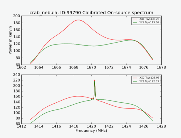
I'm familiar enough with the 20m that I can at least answer the instrumental part of your question -- what the graphs are displaying.
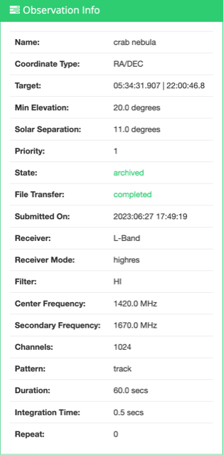
Since about 2014, the 20m has had an L-band receiver, with a wideband linear feed: it samples two linearly polarized components of the signal, which are perpendicular to one another. We can label those two polarizations in whatever way we want; here, one is designated "XX" and the other is designated "YY". Since in HIRES mode you're observing at two different frequencies ("1" and "2"), the plot of "XX1" gives the intensity of the XX polarization at frequency 1 (~1420 MHz). The plot of "YY1" gives the intensity of the YY polarization at frequency 1, and the pattern continues for the measurements at frequency 2 (~1670 MHz). (For comparison, LOWRES mode only has one central frequency, and so there are only two frequency-polarization pairs; for more information, see this page.)
"Tsys" refers to the system temperature, which is a combination of noise from the receiver, the sky, the ground, the atmosphere, the electronics, etc. I'm not an expert on the particular contributions, but it should make sense that at different frequencies or polarizations, some of these effects should change, causing slightly different system temperatures, which is what we do see.
I'm not sure what's up with the second, smaller peak, but I'm reasonably certain it's not due to the expansion of the nebula. As a very quick sanity check, you can find the difference in frequency between the peaks by looking at the calibrated spectral data from your observation. We see that the taller peak is at 1420.36621 MHz and the smaller peak is at 1419.98474 MHz. That's a frequency difference of $\Delta\nu=0.381\;\mathrm{MHz}$; converting it to a velocity difference gives
$$\Delta v=\frac{\Delta\nu}{\nu}c=\frac{0.381\;\mathrm{MHz}}{1420.3661\;\mathrm{MHz}}c\approx80.5\;\mathrm{km/s}$$
For comparison, the Crab Nebula expands at something like ~1000 km/s. Granted, most of the ejecta is not moving directly towards or away from Earth, but I still wouldn't expect to see a sharp peak like that. It does, though, appear in other 20m Crab observations in HIRES track mode, like this one, but not Crab observations in daisy mode (HIRES or LOWRES). I may be missing something extremely obvious.

